Energy · Brand
Reimagining the LPE Brand for a Brighter Future
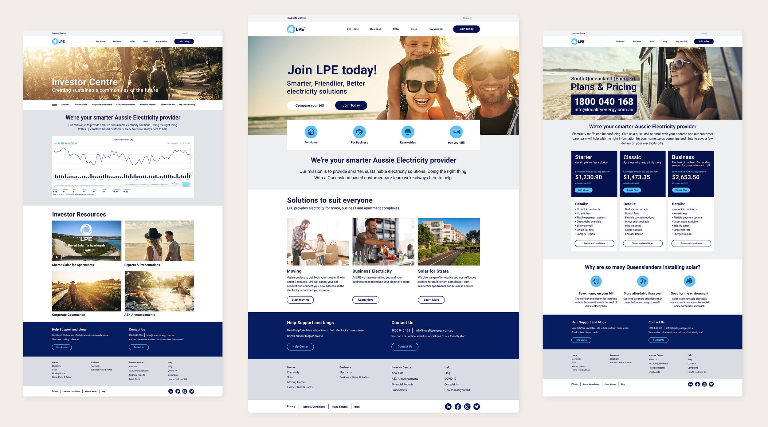
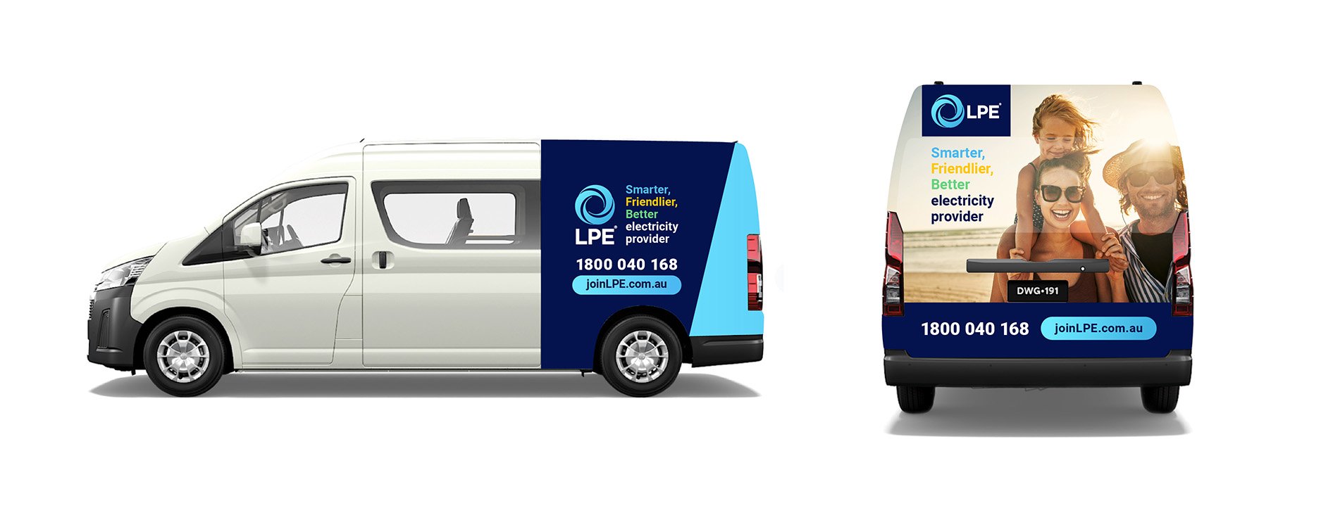
As LPE repositioned itself in the competitive Queensland retail electricity market, I led the visual identity design working alongside the Head of Marketing. The existing logo stayed, but the rebrand set out to establish LPE as the smarter, friendlier and more sustainable energy provider - a trusted challenger ready to grow its retail presence.
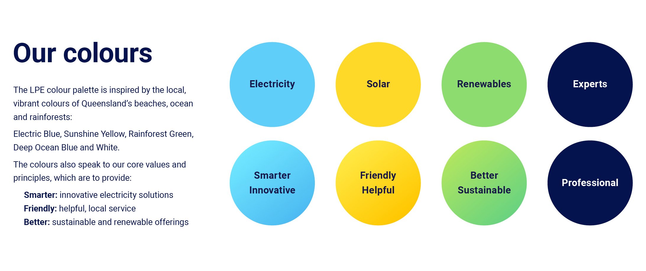
The identity system was built around a colour palette inspired by Queensland's landscapes: a deep ocean blue anchoring the brand, with electric blue, sunshine yellow and rainforest green carrying vibrancy and sustainability, balancing something grounded with something future-focused.
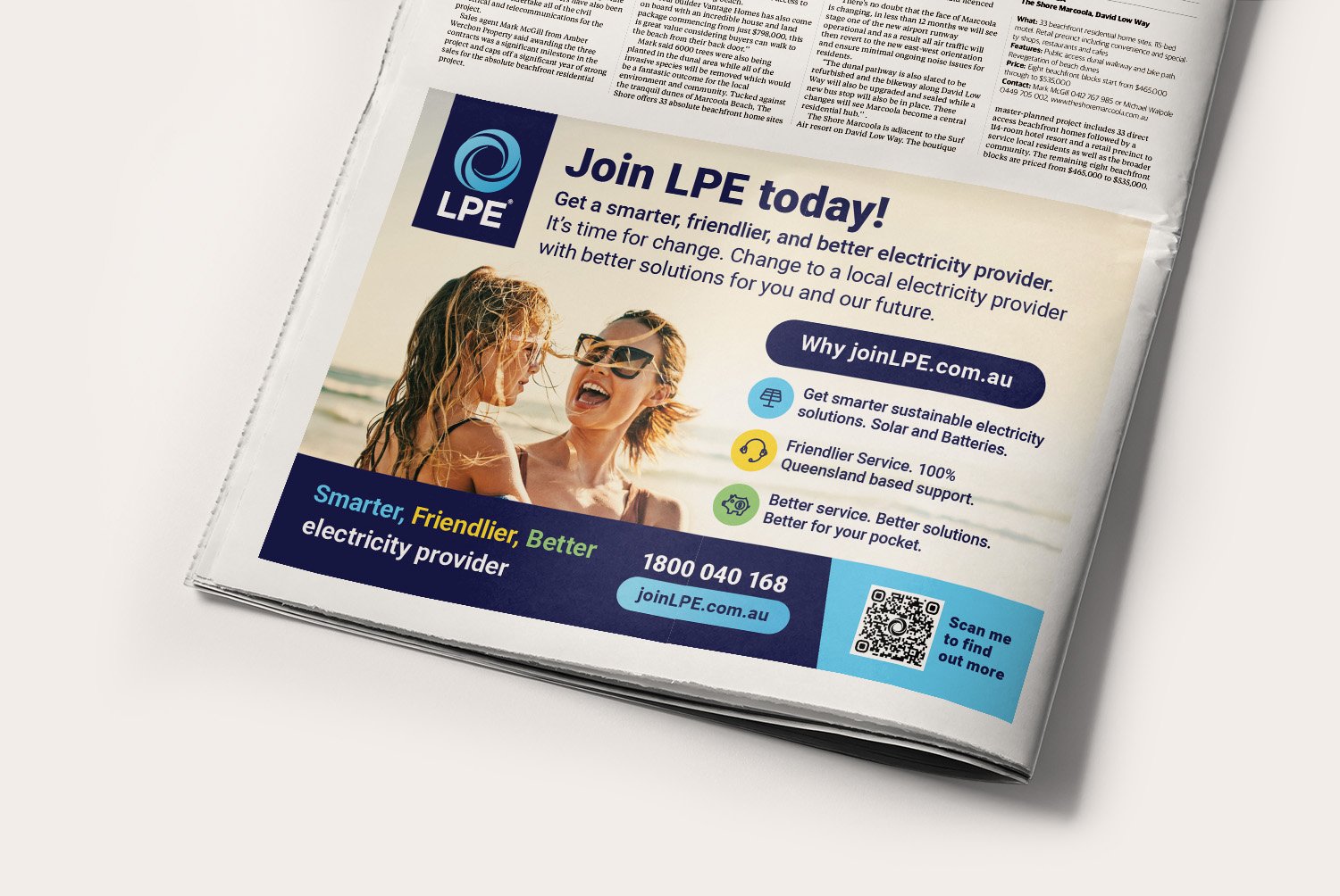
Photography guidelines reinforced the same positioning - natural light, warm sunlit tones, and authentic local settings with real people and families, resonating with LPE's audience while projecting a brighter energy future.